The Psychology of Web Design
How colors and layouts influence user behavior and drive conversions through strategic design choices.

Alexander Shcheglyayev
AI Strategy + Digital Transformation Expert
When it comes to building a website, many business owners focus on flashy graphics or slick animations — and while these elements are important, they're only part of the story. The real impact comes from design that taps into human psychology, influencing how visitors feel, think, and behave on your site.
Understanding the psychology of web design can significantly boost user engagement, improve conversions, and help your business grow. This post dives into two critical pillars of design psychology: color and layout. You'll learn how each affects user behavior, why they matter, and how to strategically apply them.
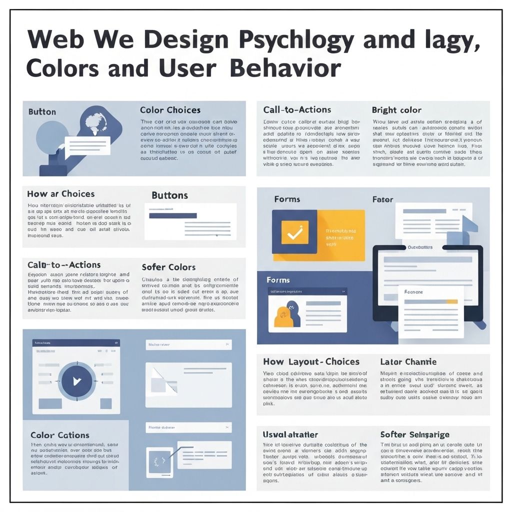
The Power of Color Psychology
Color is more than just aesthetics — it's a powerful communication tool that evokes emotions, shapes perceptions, and influences decisions. Our brains process color instantly, and those impressions often last longer than words or images.
Blue typically evokes feelings of trust and security, which explains why banks and tech companies favor it. Meanwhile, red creates urgency and excitement, making it ideal for sales or call-to-action buttons. Choosing the right color palette isn't just a branding decision; it's a strategic move to guide visitor behavior.
Layout Psychology: Guiding User Attention
While color captures attention and evokes emotions, layout serves as the roadmap that guides visitors through your website's content. A well-structured layout makes navigation intuitive, highlights key information, and encourages users to take desired actions.
Eye-tracking research shows that users scan web pages in predictable patterns. The F-pattern is common on text-heavy pages, while the Z-pattern suits simpler pages with clear calls to action. Understanding these patterns helps designers place critical content for maximum visibility and engagement.
Real-World Examples
Airbnb uses a clean, spacious layout with soft blues and whites, evoking trust and calm—key when users make big travel decisions. Spotify pairs vibrant greens with dark backgrounds to create an energetic, engaging vibe. Slack combines calming blues and purples with bright green CTAs, creating a professional yet friendly atmosphere.
These brands demonstrate how strategic color and layout choices can build trust, drive engagement, and ultimately boost conversions. The key is understanding your audience and aligning your design psychology with their expectations and behaviors.
Sources
1. Nielsen Norman Group (2023). Visual Hierarchy and User Experience Design.
2. Help Scout (2023). The Psychology of Color in Marketing and Branding.
3. Crazy Egg (2023). How Color Psychology Affects Conversion Rates.
4. Adobe (2022). Brand Impact Report: The Value of Consistent Design.
5. Google Web.dev (2024). Mobile-First Design Best Practices.
Read On
Mobile-First Design: Why Your Website Must Be Optimized
Essential strategies for creating mobile-optimized experiences that convert.
AI in Branding: Balancing Creativity with Consistency
How artificial intelligence is reshaping brand identity while maintaining authenticity.